Bank Churn Prediction Using Scikit Learn
CHAPTER ONE PROJECT PROPOSAL AND PLAN
Authors: McNamara Chiwaye
City: Harare
University: CUT
Masters: MSc In Big Data Analytics
Country: Zimbabwe
Year: 2022
Month: April
Supervisor: Dr Masamha
ABSTRACT
The chapter aims to highlight the motivation for writing this thesis and its relevance. Furthermore, it describes the objectives set for this research, the problem statement, the significance of the study and provides the scope of the study as well as the structure of the thesis regarding developing a propensity model for churn prediction in the banking industry in Zimbabwe
Defination of Key Terms
Bank Churn, EBanking, Point of Sale
Bank Churn: Loyal Customers and Customers about to leave
EBanking: Customer transacting through mobile bank channel.
Point of Sale: A device that connects Telecommunication Technologies Digital Funds Payment and Alternative Channels
Background to the study
Bank churn is a term referring to the process of a customer leaving a bank for another one. This can occur for a variety of reasons, including differences in the service provided by different banks, pricing differences, convenience for the customer, and innovation. In some cases, this term is used to refer to a “cycle of account turnover”, where customers who churn from one bank will switch to another bank. According to (Sharma & Kumar Panigrahi, 2011), churning refers to a customer who leaves one company to go to another company. Customer churn introduces not only some loss in income but also other negative effects on the operation of companies (Wang & Chen, 2010). In addition, customer retention is seen as more important than in the past. While companies pursue new customers through acquisition marketing efforts, customer churn undermines business growth. Voluntary turnover rates for banking and finance are the third-largest (after hospitality and healthcare) among all industries. Hence, analysis of customer characteristics, such as socio-demographics and activity patterns, is crucial for predictive identification of customers who are likely to churn, as well as for more efficient targeted application of marketing strategies for customer retention (Chen et al., 2018). This survey seeks to identify common characteristics of churned customers to build a customer churn prediction model. Client loss, customer attrition, is mostly recognized as major business challenges for a variety of companies, from telecommunication providers to financial institutions.
Statement of the problem
Churn is a critical area in which the banking domain can make or lose its customers. Researchers in the past were able to detect the customers who are about to churn from banks and enlightened factors that contribute to customers churning in the banking sector, moreover, these studies were not done in Zimbabwe. In the case of Zimbabwe, the decision of what actions to bring to what customers are normally left to managers who can only rely upon their limited knowledge. In the study, Logistic Regression was used to identify the customers who are most likely to churn, the contributing factors that aid to their churn, and their extent in influencing customer churn.
Research objectives
In general, the main aim of the study is to develop a propensity model to predict churn in the banking industry, the study case being CBZ bank. Specific objectives of the study are as follows:
To create a machine learning propensity model that predicts customers who are likely to churn from CBZ bank.
To evaluate the propensity model that predicts customers who are most likely to churn from CBZ bank.
Identify the reasons for customer churn
Identify key marketing and customer retention strategies
Identify marketing and customer retention strategies that are most likely to reduce churn
Identify which customers are most likely to churn and which customers are the most profitable
Identify which marketing and customer retention strategies are most likely to be effective for specific customers and why?
Research questions
What are the factors that contribute to customer churn?
What are the key marketing and customer retention strategies?
What are the benefits of developing a machine learning model that predicts customer churn from CBZ?
How to evaluate the performance of the propensity model that predicts customers who are most likely to churn?
Research prepositions
- 〖 H〗_1 ∶There is no significant relationship between quality of services and customer’s switching banks
- 〖 H〗_2 ∶There is no significant relationship between Involuntary switching and customers^’ switching of banks
- H_3:There is no significant relationship between product services and customers^’ switching of banks
- 〖 H〗_4:There is no significant relationship between reputation of the bank and customers^’ switching of banks
- 〖 H〗_5:There is no significant relationship between reputation of the bank and customers^’ s banks
Significance of the study
To the financial Institution (CBZ bank Limited Zimbabwe)
This research study aims to develop a propensity model that can be used by CBZ bank limited Zimbabwe to predict customer churn and thereby allow the financial Institution to utilize target marketing in their marketing strategy which will improve return on investments and revenue flow.
To the university
The research will provide valuable literature on propensity models and their effectiveness in the banking industry in Zimbabwe. Obtained results can be used by University students for referencing and the study will provide a solid foundation from which the future studies can be premised to improve literature on the propensity models used in target marketing in the Banking Industry.
To the researcher
The study is crucial in the sense that it would enhance critical research skills turning theoretical evidence into application complying, analyzing data and interpreting results, and developing a solution to address the research requirements.
The research enhances the researcher’s understanding of machine learning algorithms and their application in real-life scenarios.
Scope of the study
Delimitations of the study
Data period delimitation
Data that was used in this study was gathered for 5 years from 2017-to 2022. As such the sources of literature that were reviewed also fall within this period, this was mainly done so that the study would concentrate on recent events or trends in the business environment.
Geographical delimitation
The study is carried out in Zimbabwe, making use of data obtained from CBZ bank in Zimbabwe. The collection of data from Zimbabwe respondents was quite possible since the researcher is a Zimbabwean student.
Theoretical delimitations
The study was narrowed to make it more manageable and relevant to what the researcher was trying to prove since the study only focuses on the banking industry in Zimbabwe.
Limitations to the study
Accessibility of information
For confidentiality, accessing data from the CBZ respondents was a challenge. Finally, the information was issued to the University researcher since he was a student at the University of Zimbabwe
Inadequate financial resources
The researcher could not encompass all CBZ branches in Zimbabwe due to lack of funds so a representative sample was used. Where possible the researcher had to borrow a few to complete the study
Time factor
The researcher had limited time to carry out the research effectively since the researcher was a student preparing for examination at college at the time of research.
Structure of dissertation
Five chapters make up this thesis. The first chapter comprises of background information to the study, a statement to the problem, objectives of the study, research questions and their prepositions. The significance of the study, organization of the study and summary of the chapter are encompassed in the study. The second chapter deals with literature review of the study, the theoretical and empirical framework of the study. The preceding chapter enlighten the research methodology (methods utilized in developing the propensity model for customer churn. The fourth chapter dives deep into the results of the study, data analysis and also discussion of findings obtained. Chapter five shows the summary of findings, conclusion and recommendations of the whole research.
Summary and Conclusion
This chapter points to the research done on building a propensity model for detecting customer churn in banking industry of Zimbabwe. The chapter outlines the reasons for carrying out the research objectives that guide the study and also the research questions. Hindrances to the study(Limitations) were included in the discussion as well as how the limitations were surpassed by the researcher to make the job satisfactory. The preceding chapter delivers a review of related literature on the topic under study.
CHAPTER 2: LITERATURE REVIEW
fffff
| Steward Bank | POS | ECOCASH | T24 |
| ZB Bank | POS | ECOCASH | T24 |
| First Capital Bank | POS | ECOCASH | T24 |
| CABS | POS | ECOCASH | T24 |
(1) all of the customers were presented with a consent form on the banking website;
(2) customers were then randomly selected from the consent pool to participate in the study;
(3) the data collection process involved three major steps:
the first step was for the customer to log into their account on-line and to authorize the computer system to access their personal information;
the second step was for the customer to provide demographic and financial data;
and the third step was for the customer to consent to the disclosure of this information.
Customers that declined to consent to the disclosure of their personal information were still included in the study because we collected the data from the customers that were consenting to the disclosure of the information and therefore we could have a sample size of at least 100. Because we can infer the consenting group, we were able to use it as a substitute for the sample size of 100. After the consenting process was complete, the computerized system recorded the names of customers who consented to the disclosure of their personal information and those that declined to consent.
The list of those customers was then randomly divided into three equal groups.
The first group is the consenting group and the other two are the non-consenting groups.
Data collection was then repeated for the consenting group with the exception that consent was required before it was collected.
This process was repeated for the non-consenting group.
The process of data collection was designed in such a way that it allowed for the selection of the consenting customers with a random number generator.
However, this process produced a data set with a bias towards the consenting group.
A large portion of the non-consenting customers were from a low-income group.
Table 2 presents the descriptive statistics for the variable of interest (customer churn).
Table 2: Descriptive statistics for the variables of interest (customer churn).
References
Sharma, A., & Kumar Panigrahi, P. (2011). A Neural Network based Approach for Predicting Customer Churn in Cellular Network Services. International Journal of Computer Applications, 27(11), 26–31. https://doi.org/10.5120/3344-4605
Wang, F. K., & Chen, K. S. (2010). Applying Lean Six Sigma and TRIZ methodology in banking services. Total Quality Management and Business Excellence, 21(3), 301–315. https://doi.org/10.1080/14783360903553248
Chen, Y., Gel, Y. R., Lyubchich, V., & Winship, T. (2018). Deep ensemble classifiers and peer effects analysis for churn forecasting in retail banking. In Lecture Notes in Computer Science (including subseries Lecture Notes in Artificial Intelligence and Lecture Notes in Bioinformatics): Vol. 10937 LNAI. Springer International Publishing. https://doi.org/10.1007/978-3-319-93034-3_30
Test Analysis
refer to data mining text and extracting insights from it. For example you have done a survey. If you have question that require respondents to give a short answer then you are likely to end up with large amounts of character data
In this case text analysis is the way to go. In this tutorial i will show you how you can analyze data using ggplot2 and wordcloud2.
# Mc namara Chiwaye Data Scientist
#Importing
library(tidyverse)
library(googlesheets4)
library(janitor)
library(lubridate)

#Importing data

ttt <- googlesheets4::read_sheet( ss = "https://docs.google.com/spreadsheets/d/1ABs3SSvH-f0OkxwdiSbovSJW-OJLgYAP9uVDso5wU4w/edit#gid=922505677" ) %>% clean_names
#Word cloud 2

# What excites you

library(tm)
corpus <-  ttt$what_excites_you


corpus <- Corpus(VectorSource(corpus))
corpus <- tm_map(corpus, tolower)
corpus <- tm_map(corpus, removePunctuation)
corpus <- tm_map(corpus, removeNumbers)
cleanset <- tm_map(corpus, removeWords, stopwords('english'))
cleanset <- tm_map(cleanset, gsub,
                   pattern = 'young',
                   replacement = 'younger')

cleanset <- tm_map(cleanset, stripWhitespace)
tdm <- TermDocumentMatrix(cleanset)
tdm <- as.matrix(tdm)
tdm

library(wordcloud2)
w <- sort(rowSums(tdm), decreasing = TRUE)
w <- data.frame(names(w), w)
set.seed(222)
colnames(w) <- c('word', 'freq')
wordcloud2(w,
           size = 0.7,
           shape = 'pentagon',
           rotateRatio = 0.5,
           minSize = 1)
The result of running the above code is

Survey 3rd World Countries
We can do one more example
#What are the hot topics
library(tm)
corpus <-  ttt$what_are_the_hot_topic_you_are_interested_in_your_field_of_work


corpus <- Corpus(VectorSource(corpus))
corpus <- tm_map(corpus, tolower)
corpus <- tm_map(corpus, removePunctuation)
corpus <- tm_map(corpus, removeNumbers)
cleanset <- tm_map(corpus, removeWords, stopwords('english'))
cleanset <- tm_map(cleanset, gsub,
                   pattern = 'analysing',
                   replacement = 'analysis')
cleanset <- tm_map(cleanset, gsub,
                   pattern = 'daat',
                   replacement = 'data')

cleanset <- tm_map(cleanset, stripWhitespace)
tdm <- TermDocumentMatrix(cleanset)
tdm <- as.matrix(tdm)
tdm

library(wordcloud2)
w <- sort(rowSums(tdm), decreasing = TRUE)
w <- data.frame(names(w), w)
set.seed(222)
colnames(w) <- c('word', 'freq')
wordcloud2(w,
           size = 0.7,
           shape = 'hexagon',
           rotateRatio = 0.5,
           minSize = 1)
The result of running the code is below

HOT Tech Topic
The fig above show a ggplot bar plot created in R using R shiny.

Top Tech topics
Working with Dates and Times in R
Have you ever wondered how you can create several date objects just like in R as you would in PowerBi. Then this tutorial will teach you how
The library(lubridate) lets you work with dates easily in R. For example lets consider an ISO timestamp 2021-02-24 14:26:07.123000000 . We can mutate it as shown below;
 df %>%
  mutate(Day = day(LastSeenDate),
         Month = month(LastSeenDate),
         Year = year(LastSeenDate),
         Hour = hour(LastSeenDate),
         Morning = am(LastSeenDate),
         Afternoon = pm(LastSeenDate),
         Weekday = wday(LastSeenDate),
         Quarter = quarter(LastSeenDate),
         Half_Year = semester(LastSeenDate)
  )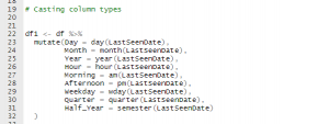
Using lubridate to create several date objects
The result of running the code is

date, mutate, lubridate
Putting it Altogether

To get daily updates remember to follow the page and leave a comment.
Cleaning Data in R: Data type Constraints
It is important to clean data before any data analysis. Tidy data is where each row is an observation an each column is a variable name.
We need clean data in order to
- access to data,
- explore and extract data,
- extract insights
- report insights.
The first problem you will encounter in data science is data type constraint. For this problem you can use the assert library to check the data type
library(assertive)
assert_is_numeric(sales$revenue)
Similarly we can use dplyr library
library(dplyr)
is.numeric(sales$revenue)
Dealing with comma problems
Suppose you have a column with character values i.e sales$ revenue = c(“5,456”, “6,567”, “4,234”) .
class(sales$ revenue ) = ‘character’
What you can do is
library(stringr)
revenue_trimmed = str_remove(sales$revenue, ",")
revenue_trimmed
Finally you can convert the character value to numeric as follows
as.numeric(revenue_trimmed)
Putting it together
If you want to do it in a single shot which is what most programmers do
library(dplyr)
library(stringr)
revenue_usd <- sales %>%
mutate(revenue_usd = as.numeric(str_remove(revenue, ",")))
mean(sales$revenue_usd)
Converting data types
as.character()
as.numeric()
as.logical()
as.factor()
as.Date()
Introduction to Data Science with R 102-104
# Instructor
# Mc Namara Chiwaye
# Data Scientist
# Install packages
# install.packages(“readr”)
# install.packages(c(“here”, “dplyr”, “ggplot2”))
# install.packages(c(“here”, “dplyr”, “ggplot2”, “readr”), dependencies = “Depends”)
# install.packages(“Rcpp”)
# install.packages(c(“readr”, “dplyr”))
# Load our packages —-
# Install packages —-
# install.packages(“readr”)
# install.packages(c(“here”, “dplyr”, “ggplot2”))
# install.packages(c(“here”, “dplyr”, “ggplot2”, “readr”), dependencies = “Depends”)
library(here)
library(readr) # for importing data
library(dplyr) # for manipulating the data
library(ggplot2) # for data visualization
# Import data and store it inside variables —-
# install.packages(“Rcpp”)
# install.packages(c(“readr”, “dplyr”))
# Load our packages —-
library(here)
library(readr) # for importing data
library(dplyr) # for manipulating the data
library(ggplot2) # for data visualization
# Import data and store it inside variables —-
flights <- read_csv(“data/raw/flights.csv”)
airports <- read_csv(“data/raw/airports.csv”)
airlines <- read_csv(“data/raw/airlines.csv”)
planes <- read_csv(“data/raw/planes.csv”)
weather <- read_csv(“data/raw/weather.csv”) # dbl – double – numeric data # dttm – date-time – date and time data # chr – character – text data # Basic data exploration —- nrow(airports) # Number of rows ncol(flights) # Number of columns dim(planes) # Number of dimensions glimpse(weather) # Gives you a detailed overview of the dataset (inside the dplyr package) summary(flights) # Distribution (summary statistics) of the columns in the data View(flights) # Data manipulation with the dplyr package —- # > filter: for filtering the data —-
# Flights to Dallas
filter(flights, dest == “DFW”)
# Flights that lasted more than 1 hour and 30 mins
filter(flights, air_time > 90)
# Flights that lasted less than 45 minutes
filter(flights, air_time < 45)
# Planes with less than or equal to 10 seats
filter(planes, seats <= 10) # Planes with more than 100 seats built by PIPER filter(planes, seats > 100, manufacturer == “PIPER”)
filter(planes, manufacturer == “PIPER”)
# Planes built after 2000 by BOEING with more than 150 seats
filter(planes, year >= 2000, manufacturer == “BOEING”, seats > 150)
# All summer flights (between June and August) that departed from JFK and that lasted at least 3 hours.
filter(flights, month >= 6, month <= 8, origin == “JFK”, air_time >= 180)
# All flights except the flights that happened in the month of January
filter(flights, month != 1)
View(filter(flights, month != 1))
flights_no_jan <- filter(flights, month != 1) View(flights_no_jan) # All flights operated by UA or AA filter(flights, carrier == “UA”, carrier == “AA”) # This is wrong! No flight can be operated by two carriers at the same time # We need to use the OR operator: | or the IN operator: %in% filter(flights, carrier == “UA” | carrier == “AA”) filter(flights, carrier %in% c(“UA”, “AA”)) # All summer flights (between June and August) that departed from JFK and that lasted at least 3 hours (with the %in% operator). filter(flights, month %in% c(6, 7, 8), origin == “JFK”, air_time >= 180)
# Weather conditions around Newark or LaGuardia in the winter months (december to february)
# when the temperature is below 40 degree and the wind speed is at least 15 miles per hour
filter(weather, origin %in% c(“EWR”, “LGA”), month %in% c(1, 2, 12), temp < 40, wind_speed >= 15)
filter(weather, origin == “EWR” | origin == “LGA”, month == 1 | month == 2 | month == 12, temp < 40, wind_speed >= 15)
# The AND operator is: &
# All airports with an altitude NOT greater 100
filter(airports, !alt > 100)
# All flights that did not depart from either JFK or EWR
View(filter(flights, !origin %in% c(“JFK”, “EWR”)))
# Calculate mean/average temperature in the month of January (Question from Kinley the chat)
weather %>%
filter(month == 1) %>%
summarize(mean_temp = mean(temp))
# > arrange: for rearranging the data —-
# Reorder the planes dataset from smallest to highest number of seats
planes_seats <- arrange(planes, seats) View(planes_seats) # Reorder the planes dataset from highest to smallest number of seats arrange(planes, -seats) arrange(planes, desc(seats)) # Reorder the planes dataset from oldest to newest plane arrange(planes, year) # Reorder the planes dataset from newest to oldest plane arrange(planes, -year) arrange(planes, desc(year)) # Reorder the airports dataset by altitude in ascending order arrange(airports, alt) # Reorder the airports dataset by altitude in descending order arrange(airports, -alt) arrange(airports, desc(alt)) # Reorder the airports dataset by airport in reverse alphabetical order arrange(airports, desc(name)) # Reorder the airlines dataset by carrier code in alphabetical order arrange(airlines, carrier) # Reorder the airlines dataset by carrier code in reverse alphabetical order arrange(airlines, desc(carrier)) # Reorder the flights dataset by scheduled departure time in chronological order arrange(flights, sched_dep_time) # Reorder the flights dataset by scheduled departure time in reverse chronological order arrange(flights, desc(sched_dep_time)) # Reorder the planes by year and seats arrange(planes, year, seats) arrange(planes, seats, year) # Reorder the flights dataset by carrier and scheduled arrival time in reverse chronological order arrange(flights, carrier, desc(sched_arr_time)) # > filter + arrange —-
# Which flights operated by United Airlines (UA) in the month of December arrived in Dallas the earliest?
ua_dfw_12 <- filter(flights, carrier == “UA”, month == 12, dest == “DFW”)
arrange(ua_dfw_12, arr_time)
arrange(filter(flights, carrier == “UA”, month == 12, dest == “DFW”), arr_time)
# Which carrier between AA and DL had the slowest flight departing from JFK on March 31?
ua_aa_jfk <- filter(flights, carrier %in% c(“AA”, “UA”), origin == “JFK”, month == 3, day == 31)
arrange(ua_aa_jfk, desc(air_time))
# What is the highest wind speed around LaGuardia (LGA) in the first week of September when the temperature is above 75 degrees?
lga_9 <- filter(weather, origin == “LGA”, month == 9, day <= 7, temp > 75)
arrange(lga_9, desc(wind_speed))
# What is the highest wind speed in the weather dataset
arrange(weather, desc(wind_speed))
# > mutate: for creating new data —-
# Convert air_time in the flights dataset to hours
mutate(flights, air_time = air_time / 60)
mutate(flights, air_time_hours = air_time / 60)
# Convert distance to kilometers
mutate(flights, distance = distance * 1.609344)
mutate(flights, distance_km = distance * 1.609344)
# Compute departure delay
flights2 <- mutate(flights, dep_delay = as.numeric(dep_time – sched_dep_time) / 60)
View(flights2)
# Compute arrival delay
flights3 <- mutate(flights, arr_delay = as.numeric(arr_time – sched_arr_time) / 60)
# Compute several delay metrics
flights4 <- mutate(flights, dep_delay = as.numeric(dep_time – sched_dep_time) / 60, arr_delay = as.numeric(arr_time – sched_arr_time) / 60, sched_air_time = as.numeric(sched_arr_time – sched_dep_time) / 60, air_time_made_up = sched_air_time – air_time) flights4[, “air_time_made_up”] # > filter + arrange + mutate —-
# Which flight to LAX operated by American Airlines had the largest departure delay in the month of May?
aa_lax <- filter(flights, carrier == “AA”, dest == “LAX”, month == 5)
aa_lax2 <- mutate(aa_lax, dep_delay = as.numeric(dep_time – sched_dep_time) / 60)
arrange(aa_lax2, desc(dep_delay))
# Which flight departing from LGA and operated by UA in the first half of the year was the shortest in hours?
ua_lga <- filter(flights, origin == “LGA”, carrier == “UA”, month <= 6)
ua_lga2 <- mutate(ua_lga, air_time = air_time / 60)
arrange(ua_lga2, air_time)
# Which flight departing from Newark had the largest total delay? (total delay = departure delay + arrival delay)
ewr_data <- filter(flights, origin == “EWR”)
ewr_data2 <- mutate(ewr_data,
dep_delay = as.numeric(dep_time – sched_dep_time) / 60,
arr_delay = as.numeric(arr_time – sched_arr_time) / 60,
total_delay = dep_delay + arr_delay)
ewr_data3 <- arrange(ewr_data2, desc(total_delay)) ewr_data3[, “total_delay”] # ~ The pipe operator: %>% —-
# Which flight to LAX operated by American Airlines had the largest departure delay in the month of May?
aa_lax_pipe <- flights %>%
filter(carrier == “AA”, dest == “LAX”, month == 5) %>%
mutate(dep_delay = as.numeric(dep_time – sched_dep_time) / 60) %>%
arrange(desc(dep_delay))
# Which flight departing from LGA and operated by UA in the first half of the year was the shortest in hours?
ua_lga <- filter(flights, origin == “LGA”, carrier == “UA”, month <= 6)
ua_lga2 <- mutate(ua_lga, air_time = air_time / 60)
arrange(ua_lga2, air_time)
ua_lga_pipe <- flights %>%
filter(origin == “LGA”, carrier == “UA”, month <= 6) %>%
mutate(air_time = air_time / 60) %>%
arrange(air_time)
# Which flight departing from Newark had the largest total delay? (total delay = departure delay + arrival delay)
ewr_data <- filter(flights, origin == “EWR”)
ewr_data2 <- mutate(ewr_data,
dep_delay = as.numeric(dep_time – sched_dep_time) / 60,
arr_delay = as.numeric(arr_time – sched_arr_time) / 60,
total_delay = dep_delay + arr_delay)
ewr_data3 <- arrange(ewr_data2, desc(total_delay)) flights %>%
filter(origin == “EWR”) %>%
mutate(dep_delay = as.numeric(dep_time – sched_dep_time) / 60,
arr_delay = as.numeric(arr_time – sched_arr_time) / 60,
total_delay = dep_delay + arr_delay) %>%
arrange(desc(total_delay))
# All planes that were manufactured before 1990
filter(planes, year < 1990) planes %>%
filter(year < 1990) # ~ A few shortcuts in RStudio # Ctrl/Cmd + Enter: Run code and move pointer to the next line # Alt + Enter: Run code and leave pointer on the same line # Ctrl/Cmd + L: Clear console # Ctrl/Cmd + Shift + C: Comment/uncomment text # Ctrl/Cmd + I: Format code # Ctrl/Cmd + Shift + R: New code section # Ctrl + 1: Move to script # Ctrl + 2: Move to console # Ctrl/Cmd + Shift + M: pipe operator (%>%)
# > summarize: for summarizing data —-
# Compute the total number of seats of all planes
planes %>%
summarize(total_seats = sum(seats))
# Average temperature in NYC (all 3 weather stations)
weather %>%
summarize(avg_temp = mean(temp, na.rm = TRUE))
# Highest humidity level in NYC (all 3 weather stations)
weather %>%
summarize(max_humid = max(humid, na.rm = TRUE))
# Lowest and highest airports and the height between them
airports %>%
summarize(max_alt = max(alt, na.rm = TRUE),
min_alt = min(alt, na.rm = TRUE)) %>%
mutate(height = max_alt – min_alt,
height_m = height * 0.3048)
# Useful summary functions: sum(), prod(), min(), max(), mean(), median(), var(), sd()
# Lesson 2 —————————————————————-
# > ungroup(): for ungrouping variables (opposite of group_by())—-
# Compute the flight count and percentage of each carrier out of each airport
carrier_origin <- flights %>%
group_by(carrier, origin) %>%
summarize(n_flights = n()) %>%
mutate(pct_flights = 100 * n_flights / sum(n_flights))
carrier_origin %>% # already grouped by carrier
summarize(total_pct = sum(pct_flights))
carrier_origin %>%
arrange(carrier, desc(n_flights))
# Compute the flight and percentage of all flights out of each airport operated by each carrier
flights %>%
group_by(origin, carrier) %>%
summarize(n_flights = n()) %>%
mutate(pct_flights = 100 * n_flights / sum(n_flights))
# Compute count and overall percentages of flights operated by each carrier out of each airport
flights %>%
group_by(carrier, origin) %>%
summarize(n_flights = n()) %>%
ungroup() %>%
mutate(pct_flights = 100 * n_flights / sum(n_flights)) %>%
arrange(desc(pct_flights))
# Compute the flight and overall percentage of all flights out of each airport operated by each carrier
flights %>%
group_by(origin, carrier) %>%
summarize(n_flights = n()) %>%
ungroup() %>%
mutate(pct_flights = 100 * n_flights / sum(n_flights)) %>%
arrange(desc(pct_flights))
# > select(): for selecting specific columns —-
# Select specific columns
flights %>%
select(year, month, day)
# Specify columns we do not want
flights %>%
select(-arr_time, -carrier)
# Select a sequence of columns
flights %>%
select(dep_time:origin)
# Discard a sequence of columns
flights %>%
select(-(dep_time:origin))
# Select columns that contain a specific string of characters
flights %>%
select(contains(“time”))
flights %>%
select(contains(“time”), -air_time)
flights %>%
select(contains(“time”), dest:distance)
flights %>%
select(matches(“time”))
# Select columns that start/end with a specific string of characters
flights %>%
select(starts_with(“dep”))
flights %>%
select(starts_with(“arr”))
flights %>%
select(ends_with(“time”))
flights %>%
select(ends_with(“e”))
# The everything() function
flights %>%
select(origin, air_time, distance, everything())
flights %>%
select(origin, distance, everything(), -contains(“time”))
# Dont do this
flights %>%
select(origin, distance, -contains(“time”), everything())
# > case_when():
# Split flight distance into 4 categories
flights %>%
select(distance) %>%
mutate(distance_label = case_when(
distance <= 500 ~ “close”, distance > 500 & distance <= 2000 ~ “fairly close”, distance > 2000 & distance <= 5000 ~ “far”, distance > 5000 ~ “very far”)) %>%
count(distance_label)
# Split temperature into 4 categories
weather %>%
select(temp) %>%
mutate(cold_level = case_when(
temp < 30 ~ “very cold”, temp >= 30 & temp < 50 ~ “cold”, temp >= 50 & temp < 65 ~ “bearable”, TRUE ~ “Others” )) %>%
group_by(cold_level) %>%
summarize(n = n())
# Split temperature into 2 categories (we can use the ifelse function also)
weather %>%
select(temp) %>%
mutate(cold_level = case_when(
temp >= 70 & temp <= 85 ~ “life is good”, TRUE ~ “life’s not so good” )) weather %>%
select(temp) %>%
mutate(cold_level = ifelse(temp >= 70 & temp <= 85, “life is good”, “life’s not so good”)) # The conditions here are based on 2 variables weather %>%
select(temp, wind_speed) %>%
mutate(
cold_status = ifelse(temp < 50, “cold”, “not cold”), wind_status = ifelse(wind_speed > 16, “windy”, “not windy”),
state_of_life = case_when(
cold_status == “not cold” & wind_status == “not windy” ~ “life’s good”,
cold_status == “cold” & wind_status == “windy” ~ “life’s not good”,
TRUE ~ “it’s okay”
)
)
# > Practicing with joins
left_join(flights, planes, by = “tailnum”) %>%
summarise(total_passengers = sum(seats, na.rm = TRUE))
# Which carrier transported the most passengers in December?
flights %>%
select(month, carrier, tailnum) %>%
filter(month == 12) %>%
left_join(planes, by = “tailnum”) %>%
count(carrier, wt = seats, sort = TRUE, name = “n_passengers”)
# Which planes were not used to fly people out of NYC?
anti_join(planes, flights, by = “tailnum”)
# Were there illegal flights out of NYC?
anti_join(flights, planes, by = “tailnum”) %>%
select(carrier, tailnum) %>%
distinct(carrier, tailnum) %>%
count(carrier, sort = TRUE)
# Certification Course DataCamp ——————————————-
#DATA MANIPULATION WITH DPLYR
#Import dataset
#Counties dataset
library(dplyr)
counties <- readRDS(“C:/Users/User/Desktop/INTERMIDIATE R/Data Manipulation with Dplyr/counties.rds”) # Inspect dim(counties) nrow(counties) ncol(counties) glimpse(counties) #Select four columns namely state, county, population, unemployment # Some important shortcut # run highlight the code or ctrl + Enter # %>% ctrl + shift + m
# hash skip line
# assignment <- alt + – #select, arrange, summarize, groupby, mutate select(counties, state, county, population, unemployment) # Alternatively counties %>%
select(state, county, population, unemployment)
counties %>% select(population, metro, everything())# select helper function
counties %>% select(contains(‘pop’))
counties %>% select(starts_with(‘un’))
counties %>% select(ends_with(‘ent’))
#Creating a new table
counties_selected <- counties %>%
select(state, county, population, unemployment)
counties_selected
View(counties_selected)
#Arrange
counties_selected %>%
arrange(population)
#Arrange: descending
counties_selected %>%
arrange(desc(population)) # desc highest value
#Filter
filter(counties, state ==’Texas’)
# Filter and arrange
counties_selected %>%
arrange(desc(population)) %>%
filter(state == “New York”)
counties_selected %>%
arrange(desc(population)) %>%
filter(unemployment < 6) #Combining conditions counties_selected %>%
arrange(desc(population)) %>%
filter(state == “New York”,
unemployment < 6)
#Mutate
counties_selected <- counties %>%
select(state, county, population, unemployment)
counties_selected
#Total number of unemployed people
population * unemployment / 100
#Mutate
counties_selected %>%
mutate(unemployed_population = population * unemployment / 100)
counties_selected %>%
mutate(unemployed_population = population * unemployment / 100) %>%
arrange(desc(unemployed_population))
#Aggregate within groups
counties %>%
group_by(state) %>%
summarize(total_pop = sum(population),
average_unemployment = sum(unemployment))
#Arrange
counties %>%
group_by(state) %>%
summarize(total_pop = sum(population),
average_unemployment = mean(unemployment)) %>%
arrange(desc(average_unemployment))
#Metro column
counties %>%
select(state, metro, county, population)
#Group by
counties %>%
group_by(state, metro) %>%
summarize(total_pop = sum(population))
#Ungroup
counties %>%
group_by(state, metro) %>%
summarize(total_pop = sum(population)) %>%
ungroup()
# The top_n verb
# top_n
counties_selected <- counties %>%
select(state, county, population, unemployment, income)
# For each state what the county with the highest population
counties_selected %>%
group_by(state) %>%
top_n(n =1,wt = population)
counties_selected %>%
group_by(state) %>%
top_n(2, population)
# Highest unemployment
counties_selected %>%
group_by(state) %>%
top_n(n =1, wt = unemployment)
# Number of observations
counties_selected %>%
group_by(state) %>%
top_n(n = 3, wt =unemployment)
counties_selected %>%
group_by(state) %>%
top_n(n = 3, wt =income)
# CHAPTER 3
# Select
counties %>%
select(state, county, population, unemployment)
# Select a range
counties %>%
select(state, county, drive:work_at_home)
# Select and arrange
counties %>%
select(state, county, drive:work_at_home) %>%
arrange(drive)
# Contains
counties %>%
select(state, county, contains(“work”))
# Starts with
counties %>%
select(state, county, starts_with(“income”))
# Other helpers
# contains()
# starts_with()
# ends_with()
# last_col()
# For more:
# ?select_helpers
# Removing a variable
counties %>%
select(-census_id)
# A tibble: 3,138 x 39
# The rename verb
#Select columns
counties_selected <- counties %>%
select(state, county, population, unemployment)
counties_selected
# Rename a column
counties_selected %>%
rename(unemployment_rate = unemployment)
#Combine verbs
counties_selected %>%
select(state, county, population, unemployment_rate = unemployment)
#Compare verbs
Select
counties %>%
select(state, county, population, unemployment_rate = unemployment)
#Rename
counties %>%
select(state, county, population, unemployment) %>%
rename(unemployment_rate = unemployment)
# The transmute verb
# Transmute
# Combination: select & mutate
# Returns a subset of columns that are transformed and changed
# Select and calculate
counties %>%
transmute(state, county, fraction_men = men/population)
# The babynames data
# import data
babynames <- readRDS(“C:/Users/User/Desktop/INTERMIDIATE R/Data Manipulation with Dplyr/babynames.rds”) #The babynames data babynames # Frequency of a name babynames %>%
filter(name == “Amy”)
#Amy plot
library(ggplot2)
babynames_filtered <- babynames %>%
filter(name == “Amy”)
ggplot(data, aes()) +
geom_line()
ggplot(data =babynames_multiple, aes(x = year, y = number))+ geom_line()
#Filter for multiple names
babynames_multiple <- babynames %>%
filter(name %in% c(“Amy”, “Christopher”))
#When was each name most common?
babynames %>%
group_by(name) %>%
top_n(1,number)
# Grouped mutates
# Review: group_by() and summarize()
babynames %>%
group_by(year) %>%
summarize(year_total = sum(number))
# Combining group_by() and mutate()
babynames %>%
group_by(year) %>%
mutate(year_total = sum(number))
# ungroup()
babynames %>%
group_by(year) %>%
mutate(year_total = sum(number)) %>%
ungroup()
# Add the fraction column
babynames %>%
group_by(year) %>%
mutate(year_total = sum(number)) %>%
ungroup() %>%
mutate(fraction = number / year_total)
# Window functions
v <- c(1, 3, 6, 14)
v
lag(v)
# Compare consecutive steps
v – lag(v)
library(dplyr)
# Changes in popularity of a name
babynames_fraction <- babynames %>%
group_by(year) %>%
mutate(year_total = sum(number)) %>%
ungroup() %>%
mutate(fraction = number / year_total)
# Matthew
babynames_fraction %>%
filter(name == “Matthew”) %>%
arrange(year)
# Matthew over time
babynames_fraction %>%
filter(name == “Matthew”) %>%
arrange(year) %>%
mutate(difference = fraction – lag(fraction))
# Biggest jump in popularity
babynames_fraction %>%
filter(name == “Matthew”) %>%
arrange(year) %>%
mutate(difference = fraction – lag(fraction)) %>%
arrange(desc(difference))
# Changes within every name
babynames_fraction %>%
arrange(name, year) %>%
mutate(difference = fraction – lag(fraction)) %>%
group_by(name) %>%
arrange(desc(difference))
# Congratulations!
# D ATA M A N I P U L AT I O N W I T H D P LY R
#
# Summary
# select()
# filter()
# mutate()
# arrange()
# count()
# group_by()
# summarize()
Getting started with Flexdashboard
Here at RStatsZim we value reader-friendly presentations of our work. When you want to create a dashboard you start with a sketch.
When creating a layout, it’s important to decide up front whether you want your charts to fill the web page vertically (changing in height as the browser changes) or if you want the charts to maintain their original height (with the page scrolling as necessary to display all of the charts).
Chart Stack(fill)
This layout is a simple stack of two charts. Note that one chart or the other could be made vertically taller by specifying the data-height attribute.
Dashboard Basics
Components
You can use flexdashboard to publish groups of related data visualizations as a dashboard. A flexdashboard can either be static (a standard web page) or dynamic (a Shiny interactive document). A wide variety of components can be included in flexdashboard layouts, including:
- Interactive JavaScript data visualizations based on htmlwidgets.
- R graphical output including base, lattice, and grid graphics.
- Tabular data (with optional sorting, filtering, and paging).
- Value boxes for highlighting important summary data.
- Gauges for displaying values on a meter within a specified range.
- Text annotations of various kinds.
---
title: "Single Column (Fill)"
output:
  flexdashboard::flex_dashboard:
    vertical_layout: fill
---

### Chart 1

```{r}

```

### Chart 2

```{r}

```
Single Column (Scroll)
Depending on the nature of your dashboard (number of components, ideal height of components, etc.) you may prefer a scrolling layout where components occupy their natural height and the browser scrolls when additional vertical space is needed. You can specify this behavior via the vertical_layout: scroll option. For example, here is the definition of a single column scrolling layout with three charts:
---
title: "Single Column (Fill)"
output:
  flexdashboard::flex_dashboard:
    vertical_layout: scroll
---

### Chart 1

```{r}

```

### Chart 2

```{r}

```
Multiple Columns
To lay out charts using multiple columns you introduce a level 2 markdown header (————–) for each column. For example, this dashboard displays 3 charts split across two columns:
---
title: "Multiple Columns"
output: flexdashboard::flex_dashboard
---

Column {data-width=600}
-------------------------------------

### Chart 1

```{r}

```

Column {data-width=400}
-------------------------------------

### Chart 2

```{r}

```

### Chart 3

```{r}

```
Row Orientation
You can also choose to orient dashboards row-wise rather than column-wise by specifying the orientation: rows option. For example, this layout defines two rows, the first of which has a single chart and the second of which has two charts:
 ---
title: "Row Orientation"
output:
  flexdashboard::flex_dashboard:
    orientation: rows
---

Row
-------------------------------------

### Chart 1

```{r}

```

Row
-------------------------------------

### Chart 2

```{r}

```

### Chart 3

```{r}

```
Tabset Column
This layout displays the right column as a set of two tabs. Tabs are especially useful when you have a large number of components to display and prefer not to require the user to scroll to access everything.
---
title: "Tabset Column"
output: flexdashboard::flex_dashboard
---

Column
-------------------------------------

### Chart 1

```{r}
```

Column {.tabset}
-------------------------------------

### Chart 2

```{r}
```

### Chart 3

```{r}
```
Tabset Row
This layout displays the bottom row as a set of two tabs. Note that the {.tabset-fade} attribute is also used to enable a fade in/out effect when switching tabs.
---
title: "Tabset Row"
output:
  flexdashboard::flex_dashboard:
    orientation: rows
---

Row
-------------------------------------

### Chart 1

```{r}
```

Row {.tabset .tabset-fade}
-------------------------------------

### Chart 2

```{r}
```

### Chart 3

```{r}
```
Multiple Pages
This layout defines multiple pages using a level 1 markdown header (==================). Each page has its own top-level navigation tab. Further, the second page uses a distinct orientation via the data-orientation attribute. The use of multiple columns and rows with custom data-width and data-height attributes is also demonstrated.
---
title: "Multiple Pages"
output: flexdashboard::flex_dashboard
---

Page 1
=====================================

Column {data-width=600}
-------------------------------------

### Chart 1

```{r}
```

Column {data-width=400}
-------------------------------------

### Chart 2

```{r}
```

### Chart 3
```{r}
```

Page 2 {data-orientation=rows}
=====================================

Row {data-height=600}
-------------------------------------

### Chart 1

```{r}
```

Row {data-height=400}
-------------------------------------

### Chart 2

```{r}
```

### Chart 3

```{r}
```
Storyboard
This layout provides an alternative to the row and column based layout schemes described above that is well suited to presenting a sequence of data visualizations and related commentary.
title: "Storyboard Commentary"
output:
  flexdashboard::flex_dashboard:
    storyboard: true
---

### Frame 1

```{r}
```

***

Some commentary about Frame 1.

### Frame 2 {data-commentary-width=400}

```{r}
```

***

Some commentary about Frame 2.
Note that the storyboard: true option is specified and that additional commentary is included alongside the storyboard frames (the content after the *** separator in each section)
Input Sidebar
This layout demonstrates how to add a sidebar to a flexdashboard page (Shiny-based dashboards will often present user input controls in a sidebar). To include a sidebar you add the .sidebar class to a level 2 header (——————-):
---
title: "Sidebar"
output: flexdashboard::flex_dashboard
runtime: shiny
---

Inputs {.sidebar}
-------------------------------------

```{r}
# shiny inputs defined here
```

Column
-------------------------------------

### Chart 1

```{r}
```

### Chart 2

```{r}
```
Input Sidebar (Global)
If you have a layout that uses Multiple Pages you may want the sidebar to be global (i.e. present for all pages). To include a global sidebar you add the .sidebar class to a level 1 header (======================):
---
title: "Sidebar for Multiple Pages"
output: flexdashboard::flex_dashboard
runtime: shiny
---

Sidebar {.sidebar}
=====================================

```{r}
# shiny inputs defined here
```

Page 1
=====================================

### Chart 1

```{r}
```

Page 2
=====================================

### Chart 2

```{r}
```
In the next post we will have an update of how to fill out layouts of rows and columns
Creating a Scatter Plot
We will use the popular mtcars, diamonds and mpg csv files throughout the tutorial. You can click on the dataset name if you want to follow along. To make a scatter plot using Base R, we make use of the plot(formula) function, where
formula input is of the syntax y ~ x (y relates to the y-axis and relates to the
x-axis).
Simple Scatter-plot
# Draw the scatter plot
with(mtcars,
plot(mpg ~ wt,
ylab = 'MPG',
xlab = 'Weight',
main = 'MPG vs. Weight',
col = 'cyan4',
pch = 16)) # pch determines point type.

# Draw a trend line over the scatter plot
abline(lm(mpg ~ wt, mtcars),
col = 'salmon',
lwd = 2) # line width
Multiple Scatter Plots
For a more complex example, let’s make multiple scatter plots via a for loop.
# Set up a 2x2 canvas
par(mfrow = c(2,2))
# Set up a 2x2 canvas
par(mfrow = c(2,2))
# Set parameters
unique_gears <- sort(unique(mtcars$gear))
mycolors <- c('cyan4', 'salmon','forestgreen')
# Begin plot loop
for (i in seq_along(unique_gears)) {
  # Subset by number of gears
  ss <- subset(mtcars, gear == unique_gears[i])
  # Plot a scatter points
  with(ss,
       plot(mpg ~ wt,
            col = mycolors[i],
            ylab = 'MPG',
            xlab = 'Weight',
            main = paste0('MPG vs. Weight (No. of Gears = '
                          ,unique_gears[i],
                          ')')))
 # Generate a trendline for each subset.
  abline(lm(mpg ~ wt, ss))
}
We can see the graphs below.

Text Plot
To make a text plot, we just turn off the points in the plot() function via type
= ‘n’ and then use the text() function to label them on the graph.
Scatter Plot
Scatter-Plots with ggplot2
A Graphing Template
ggplot(data =  <DATA>) +
     <GEOM_FUNCTION>(mapping =aes(<MAPPINGS>))
To create a basic scatter plot with ggplot run the code below.
library(ggplot2)
ggplot(data = mpg) +
    geom_point(mapping = aes(x = displ, y = hwy))

The plot shows a negative relationship between engine size (displ) and fuel efficiency (hwy).
In other words, cars with big engines use more fuel. Does this confirm or refute your hypothesis about fuel efficiency and engine size?You can convey information about your data by mapping the aesthetics
in your plot to the variables in your dataset.
You can convey information about your data by mapping the aesthetics
in your plot to the variables in your dataset. For example, you
can map the colors of your points to the class variable to reveal the
class of each car:
ggplot(data = mpg) +
geom_point(mapping = aes(x = displ, y = hwy, color = class))
In the preceding example, we mapped class to the color aesthetic,
but we could have mapped class to the size, shape, stroke, alpha aesthetic in the same
way.
# Try this
ggplot(data = mpg) +
geom_point(mapping = aes(x = displ, y = hwy, size = class))
# Alpha
ggplot(data = mpg) +
geom_point(mapping = aes(x = displ, y = hwy, alpha = class))
# Shape
ggplot(data = mpg) +
geom_point(mapping = aes(x = displ, y = hwy, shape = class))
A list of shape code that you can add to your scatter-plots

Facets
One way to add additional variables is with aesthetics. Another way,
particularly useful for categorical variables, is to split your plot into
facets, subplots that each display one subset of the data.
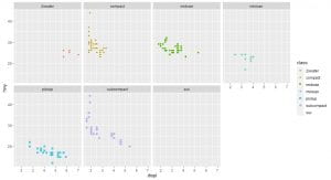
shape takes a maximum of 6 discrete variables
If you want you can add labs and themes to your plots to make them look very professional. BBC uses B
B? Click the tooltip to learn more about data journalism.
Bar charts with ggplot2
How to make a bar chart
To make a bar chart with ggplot2, you need a dataset and a categorical variable. Broadly, data can be split into two distinct types namely categorical and continuous data. I will explain this in another post. To create a bar plot add geom_bar() to the ggplot template. See a full size basic bar plot here: basic bar plot. For example, the code below plots a bar chart of the cut variable in the diamonds dataset, which you can download here diamonds.
library(ggplot2)
ggplot(data = diamonds) +
  geom_bar(mapping = aes(x = cut))

We can add color and fill. In the chart below, i have set the color equal to cut and the result you get is not quite what you expected right?
library(ggplot2)
ggplot(data = diamonds) +
   geom_bar(mapping = aes(x = cut, color = cut))
In we wanted to create a colorful bar chart we can set the fill to cut.
library(ggplot2)
ggplot(data = diamonds) +
geom_bar(mapping = aes(x = cut, fill = cut)) 
It gets better, you can actually make your plot look more professional by adding to it another layer called labs
library(ggplot2)
ggplot(data = diamonds) +
  geom_bar(mapping = aes(x = cut, fill = cut))+
  labs(title =    "Diamonds cut vs Count",
       subtitle = "A plot of the different cuts of diamond and their count",
       x=         "Diamond cut",
       y =        "Number of Diamonds",
       caption =  "Source: https://www.kaggle.com/shivam2503/diamonds
for Zimbabwe DataScience community by McNamara Chiwaye") 
In the next post you will learn how to draw scatter-plots in R.
Setting up R
Data science is an exciting discipline that allows you to turn raw data into understanding, insight, and knowledge. The goal of R for Data Science is to help you become faster. In this post you will learn the most important tools in R that will allow you to do data science.
Data science is a huge field, and the best way you can master it by reading and coding.First you must import your data into R. This typically means that you take data stored in a file, database, or web API, and load it into a data frame in R. If you can’t get your data into R, you can’t do data science on it!
Once you’ve imported your data, you need to clean it. Tidy data is important because the consistent structure lets you focus your struggle on questions about the data, not fighting to get the data into the right form for different functions. Once you have tidy data, a common first step is to transform it. Transformation includes narrowing in on observations of interest (like all people in one city, or all data from the last year), creating new variables that are functions of existing variables (like computing velocity from speed and time), and calculating a set of summary statistics (like counts or means). Together, tidying and transforming are called wrangling, because getting your data in a form that’s natural to work with often feels like a fight!
Once you have tidy data with the variables you need, there are two main engines of knowledge generation: visualization and modeling.

A good visualization might also hint that you’re asking the wrong question, or you need to collect different data. Visualizations can surprise you, but don’t scale particularly well because they requiModels are complementary tools to visualization. Once you have made your questions sufficiently precise, you can use a model to answer them. Models are a fundamentally mathematical or computational tool, so they generally scale well.The last step of data science is communication, an absolutely critical part of any data analysis project. Surrounding all these tools is programming. Programming is a crosscutting tool that you use in every part of the project.
This site focuses exclusively on rectangular data: collections of values that are each associated with a variable and an observation.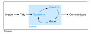
Hypothesis Confirmation It’s possible to divide data analysis into two camps: hypothesis generation and hypothesis confirmation (sometimes called confirmatory analysis).
It’s common to think about modeling as a tool for hypothesis confirmation, and visualization as a tool for hypothesis generation. But that’s a false dichotomy: models are often used for exploration, and with a little care you can use visualization for confirmation. The key difference is how often you look at each observation: if you look only once, it’s confirmation; if you look more than once, it’s exploration.
R
To download R, go to CRAN, the comprehensive R archive network. https:// cloud.r-project.org.
RStudio
RStudio is an integrated development environment, or IDE, for R programming. Download and install it from http://www.rstu dio.com/download.
The Tidyverse
You’ll also need to install some R packages. An R package is a collection of functions, data, and documentation that extends the capabilities of base R.
You can install the complete tidyverse with a single line of code:
install.packages("tidyverse")

library(tidyverse)
This tells you that tidyverse is loading the ggplot2, tibble, tidyr, readr, purrr, and dplyr packages. These are considered to be the core of the tidyverse because you’ll use them in almost every analysis. You can see if updates are available, and optionally install them, by running tidy verse_update().
If we want to make it clear what package an object comes from, we’ll use the package name followed by two colons, like dplyr::mutate() or nycflights13::flights. This is also valid R code.
Getting Help and Learning More. If you get stuck, start with Google. Typically, adding “R” to a query is enough to restrict it to relevant results: if the search isn’t useful, it often means that there aren’t any R-specific results available.
If Google doesn’t help, try stackoverflow. Start by spending a little time searching for an existing answer; including [R] restricts your search to questions and answers that use R. If you don’t find anything useful, prepare a minimal reproducible example or reprex. A good reprex makes it easier for other people to help you, and often you’ll figure out the problem yourself in the course of making it.